Bridal Style
Wedding Color Palette Ideas for Every Season and Celebration Style
Six adaptable wedding palettes, a venue-first method, and practical checks for flowers, lighting, and readable stationery.
Choose wedding colors by looking at your venue first, then selecting a neutral base, a main color, and a small accent. Test physical samples together in the light where the celebration will happen. A coordinated palette depends more on proportion and materials than on making every object an exact color match.
Season can inspire you, but it is not a dress code. A winter wedding can use pale flowers, and a summer celebration can look beautiful in deep green. Let the building, available materials, and the atmosphere you want guide the final choices.
Keep a separate list of nonnegotiable details and flexible ones. You might care deeply about dark lettering and a particular ribbon while remaining open to several flower varieties. Share that distinction with vendors so their substitutions preserve your intention instead of matching an image at any cost.
Read the room before choosing the ribbon
Photograph the floor, walls, curtains, chairs, and major architectural features during a venue visit. Notice strong existing colors: patterned carpet, red brick, honey-colored wood, or blue upholstery. Work with these elements unless you have a realistic plan and budget to cover them.
Ask what furniture and linens are included. Building a palette around chairs already in the room can save rentals and setup work. Check both the ceremony and reception spaces; they can share an accent without needing to look identical.
Six palettes to make your own
| Palette | Atmosphere | Practical use |
|---|---|---|
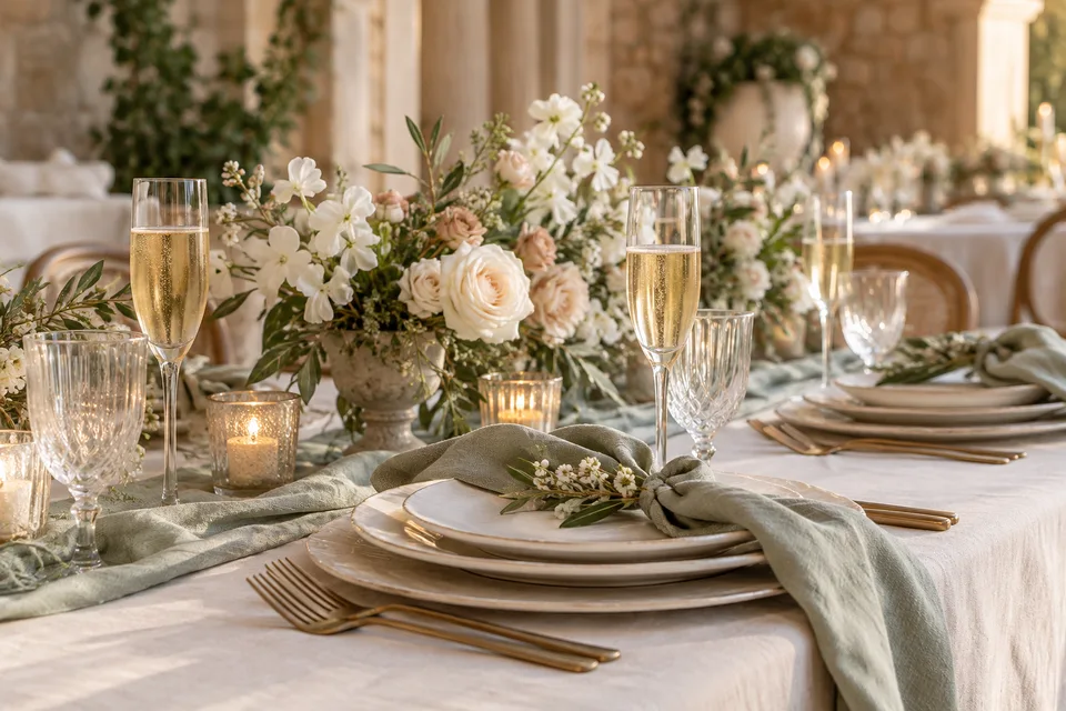
| Ivory, sage, soft gold | Quiet garden celebration | Ivory linens, foliage, restrained metallic details |
| Blush, plum, warm cream | Romantic with depth | Pale base with plum in ribbons or small floral accents |
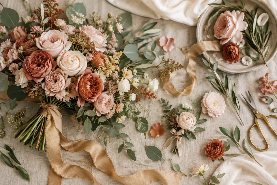
| Terracotta, apricot, olive | Warm courtyard dinner | Earthy vessels, peach flowers, green foliage |
| Navy, white, pale blue | Crisp and formal | White stationery with dark lettering and blue details |
| Forest, ivory, burgundy | Rich evening setting | Light table base with deeper color above it |
| Butter yellow, cream, soft green | Bright daytime gathering | Light fabrics and small fresh floral arrangements |
Choose one combination as a direction, not a shopping specification. A florist may suggest a nearby shade with better availability. Several related tones often look more natural together than a demand that every petal match a printed swatch.
Use season as a practical filter
For spring, pale green with cream can feel fresh without depending on one particular bloom. In summer, apricot and olive can complement warm outdoor materials. For autumn, plum or terracotta adds depth. In winter, ivory with forest green can sit comfortably against wood and evening light.
These are design suggestions, not claims about what flowers will be locally in season. Tell your florist the event location, date, budget, and preferred mood. Ask for locally realistic options and agree which substitutions are acceptable before a specific variety becomes central to the design.
Give the palette a hierarchy
A useful starting experiment is to make the neutral the largest visible area, the main color the next largest, and the accent the smallest. You do not need to measure percentages. Lay out a napkin, a piece of stationery, a ribbon, and a flower sample to see where your eye goes first.
If everything competes, remove an accent before adding another color. Repeating a small detail, such as a burgundy ribbon or dark green menu heading, can tie the room together. Metallics can act as an accent, but mixing a few finishes deliberately is different from purchasing every object in gold.
Design the flowers as shapes and textures
Color alone does not describe an arrangement. Airy foliage, rounded blooms, and sculptural branches create different effects even in the same palette. Share references for size, height, density, and placement as well as shades. Specify where guests need clear sightlines across the table.
Ask about fragrance, pollen, access restrictions, and the stability of vessels. If arrangements move between spaces, assign the task and timing. A design that looks beautiful at the ceremony must also fit the reception tables without blocking conversations or service.
Coordinate clothing without making people identical
Give attendants a clear range of tones and formality, plus practical fabric guidance. Provide a physical reference if close coordination matters. Online color names are inconsistent, and the same shade can look different in satin, chiffon, wool, or velvet.
Let comfort, availability, and price matter. If people are purchasing their own clothes, discuss the budget privately and early. A varied group of outfits can still look intentional when length, level of formality, or one color family provides continuity. Our bridal style guide applies the same practical approach to the wedding outfit.
Test lighting before final approval
Take samples into daylight and into lighting similar to the evening reception. Warm lamps can shift how pale pink, ivory, and yellow appear. Ask the venue or lighting supplier what fixtures will be used and whether colored effects will change the room during dinner.
Photograph the samples together as a reference, but do not treat a phone screen as a perfect color proof. For printed stationery, ask for a physical proof when color matters. Fabric and paper will rarely match perfectly because they reflect light differently.
Make the information readable
Keep names, times, directions, and menu details clear against their background. The W3C guidance on digital text contrast explains why pale text can be difficult to read online. Those digital criteria are not a print standard, but the underlying lesson is useful: decorative color should not obscure essential information.
Use dark text on light paper for practical details and reserve pale tones for borders or illustrations. Do not rely on color alone to identify dietary choices or seating groups; add words or distinct symbols. Test a printed sample at its actual size before approving the whole order.
Your final sample-board check
- View the palette beside venue materials.
- Approve a neutral, a main color, and a restrained accent.
- Confirm flower substitutions and rental availability.
- Check evening lighting and stationery readability.
- Share one final reference board with vendors.
A palette should make decisions easier. Keep the combinations flexible enough for real materials and real people, then stop collecting competing references. Use the budget guide to decide which visual details deserve the spending.
Published by Anna’s Weddings Editorial. Examples are illustrative; planning suggestions should be adapted to your location, venue, and circumstances. Read our editorial standards.